When I was trying to create a landing page I had trouble trying to figure out how to choose a color palette. It was hard to find what colors to use and decide what colors are a great combination together.
I know colors are important and can make or break a website so I wanted to know what was the best way to approach this problem. So I did what I do best and typed in my problem in youtube.
I found a video that provided a few great resources along with a short guide on how to use them.
As soon as I landed on the sites they had a great design along with a great user interface. So not only was it helpful, but it was inspirational. Designs I will definitely put in my swipe files (reference folder) to use later.
Here are 3 resources to help you choose a color scheme
3 Sites to help choose a color palette for a website
When it comes to a color picker this is a new and modern approach to it. Use these 3 sites to help you on your next project.
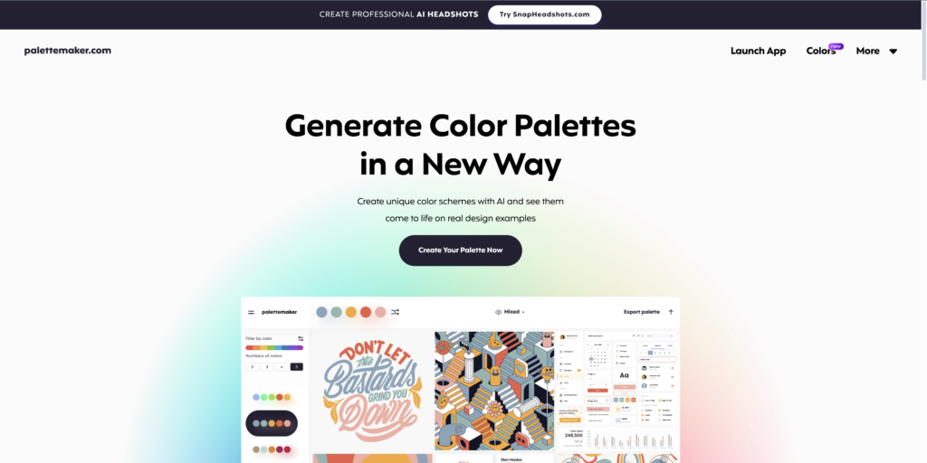
- Palette Maker
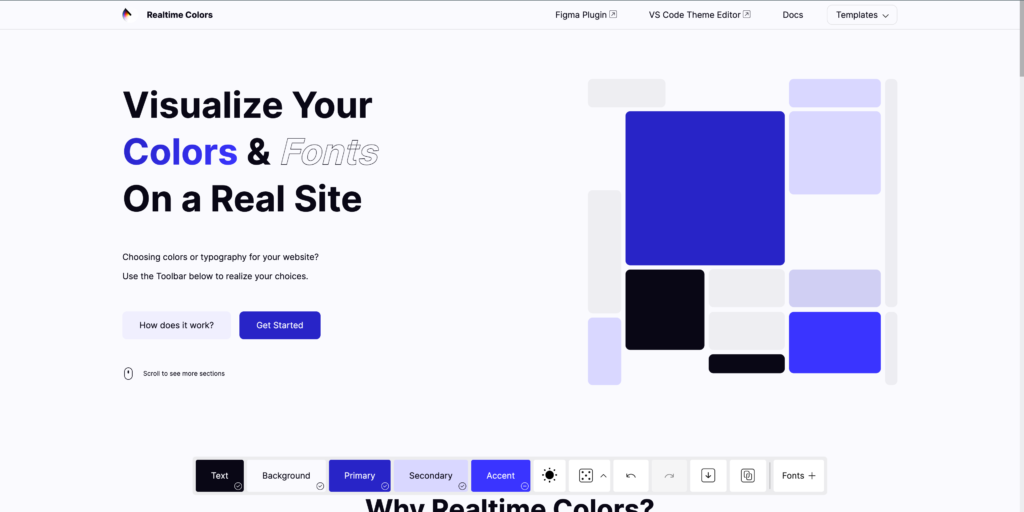
- Realtime Color
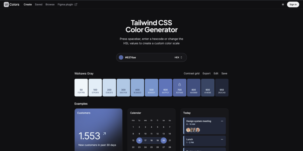
- UI Colors
1) Palette Maker

2) Real Time Color

3) UI Colors

Now you can pick any color and let the site be your guide to great design.
A word of advice, you don’t have to reinvent the wheel.
You can literally copy what you see and copy how the colors are used for each element.
Meaning if the hero section background is red and if the call to action button is a light blue then copy each element as you see it.
This will help overtime when you’ve done it multiple times. You will remember how to design from your memory and different color palettes, but it helps to first copy the elements to your own project.
