
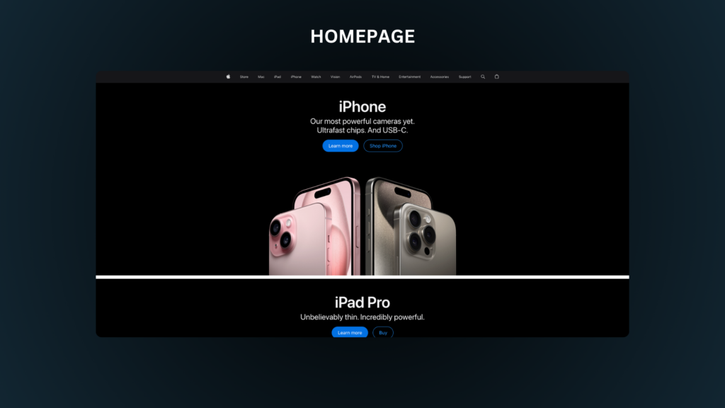
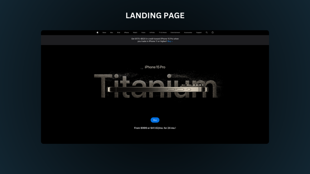
Have you ever wondered what the difference is between a landing page and a website?
Well today we’re going find out exactly what those differences are and how any beginner can learn how to design a killer landing page.
I’ll also walk you through the 7 sections that every successful landing page share and how you can access these new super powers to spot these elements and place them in your own designs.
Not only that but at the end I will show you how you can even build your very own landing page today, along with a few amazing examples of designs I personally found that you can use as inspiration.
What Makes A Landing Page Special?
Before we get into the 7 sections do you know that there is one thing that separates a landing page from any other website. Heres a quick quiz to see if you can spot the difference between the two pages below.
Did you see it? No, well think about this.
Imagine you’re hungry and you found 2 restaurants next to each other. The one on the left had several options on the menu, burgers, salads, pastas, and wings. The restaurant on the right only had one option…sandwiches.
However, there is a catch with this small menu of sandwiches. They know how to make these sandwiches really good and because of that they get repeat customers everyday.
Since they’ve decided to focus only on a few sandwiches, customers don’t have to take a long time to decide which sandwich they want.
It makes it easier for the restaurant and the customer.
That is what seperates the 2, one has a single focus while the other has so many other options to choose from.
So can you see the difference between the 2 sites now?
A landing page has one single focus they want the visitor to do, while a regular website can have 20 different things a visitor can do.
Once I learned this I began to see a pattern all landing pages shared. But did you know there are 13 types of landing pages?
For this article we will be going over the design of the most common type of landing pages: The Sales Page
I’ll leave link at the bottom of this article if you want to read more about the different types, but for now we’ll focus on sales page.
We’re going to breakdown each section and see how many businesses use this layout to convert visitors into customers and how you can too.
If you want my 7 step structure, you can use my template here → Landing Page Template
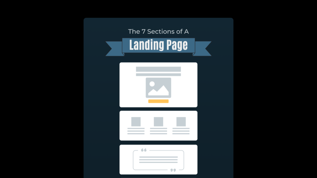
The 7 Sections Every Landing Page Needs
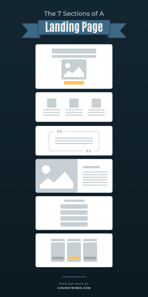
Section 1: The Hero Section
Do you know what all stories have in common?
A main character, or a hero of the story.
It’s what brings a story together. And like every story there is a desire a plot and a resolution. At the beginning of every story we are brought into a world and introduced into that characters world.
We then learn why we should invest our time to find out the importance of this characters hopes and dreams.
Your hero section is no different but in this world you introduce your story in 2 ways. With a compelling title or a combination of a title and a supporting image.
This all happens in what is known as “above the fold”. It is the most important section any visitor will land on. Why, because its your first impression to hook your visitor, and if you don’t get this right your visitors will leave without giving your story a chance.
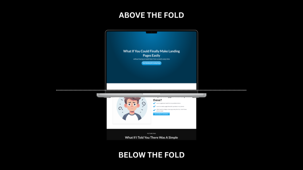
A fun fact: its called above the fold because it is the initial view visitors will see before they scroll down the page. It comes from a newspaper term and refers to the top half before it was unfolded. It now has been adapted to the digital space.
In the hero section there are 3 things that play a vital role:
- Headline (Title)
- Supporting image (optional)
- CTA (call to action) Button
These 3 elements are what determine a reader from scrolling and seeing what else you have to say, especially your headline. It is said that your headline is the key factor that hooks any reader/viewer to continue reading. It’s your make it or break it moment.
So let’s dive a little more into the elements.
The Headline (hook)
Next time you’re on youtube and you click on a video ask yourself what made you click. Most likely it’s the thumbnail and title. If your title sucks no one will click on your video. But its not just for youtube but in any medium you want to grab a reader’s attention. So learning how to write headlines is probably the most important thing you can learn.
I wrote a simple post on 7 headline formulas you can use to learn how to structure your headlines. But one thing to keep in mind when creating headlines is – stating how what you’re offering can help your reader reach their goal and solve their problem.
So a simple framework to think about is:
Big idea > End result > The transformation your offer provides
Also 3 questions to help you get started creating a headline are:
- What’s the product or offer?
- What do you promise it will do?
- What makes it so special?
If you’re still having trouble my favorite thing to do is finding other titles you can use as inspiration and model after them. That’s why I recommend creating a swipe or reference file so you can always have a starting point for creating your own.
Here is a sample of one I like from my personal swipe file
As you can see it includes the main headline and a sub headline to describe what you will get from their solution.
Supporting image
You’ve heard the famous quote that a picture is worth a 1000 words but actually its much more. In fact we can process images 60,000 times faster than words. Therefore an image can really increase your hook potential, but there are a few thing to keep in mind though.
There are 2 types of images you can have, the product image or what the product represents.
With these 2 types of image they can also be displayed in 3 ways
- Fullscreen background
- A side image
- Or a teaser (product demo)
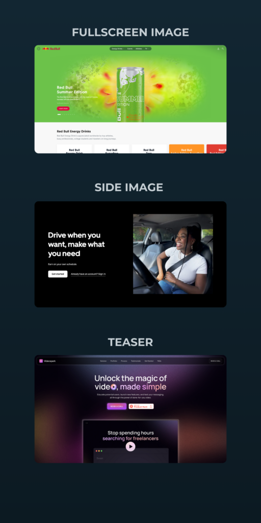
So it all depends how you want to present your offer.
Call to Action
Remember that one goal we talked about earlier? This is where you put that into action – with a button. Whatever you want your visitor to do, make it known here on this element.
The important thing to remember is to keep the same message throughout the page. You want to be consistent and only give the visitor 2 options: buy or leave.
Section 2: Solutions Section
Do you know how to blow someone’s mind?
Before I tell you how let me tell you something that just happened to me the other day. I’ve been using apple products since 2010.
So I can say with absolute certainty that I’m no Veteran when it comes to using this product. However, I recently realized that I am still finding new features that this computer can do.
I was at work and there we use windows, which absolutely hurts my soul sometimes switching back and forth everyday. Yet there is one feature I do like, especially when writing.
It’s the function of the delete button.
Instead of deleting from left to right I wanted to know if you could do the same like windows and delete anything behind the cursor.
Did you know if you hold the function button (fn) and press delete, it deletes anything behind the cursor.
When I discovered that I said to myself “apple truly takes their time to think about the quality of their product” because even with less keys you still have the ability as if you had a full keyboard.
That was a mind blowing moment. Even after 14 years of using a mac I am still finding new and useful features.
That is what this section should do for your visitors. It should highlight why this product is so amazing and what it will do for your potential customer.
But be careful because a common mistake is just listing the features (facts) instead of describing how the product can be useful. In other words you want to answer the question: ”why does this matter to me?”.
An even better question to ask yourself about a feature is “So What“.
Here is an example how you would change a basic feature and use the “so what” method to describe its usefulness, or what is known as the benefit.
Feature: Comes with a new battery
So what?
Benefit: a long lasting battery with a 12 hour charge for those late study sessions
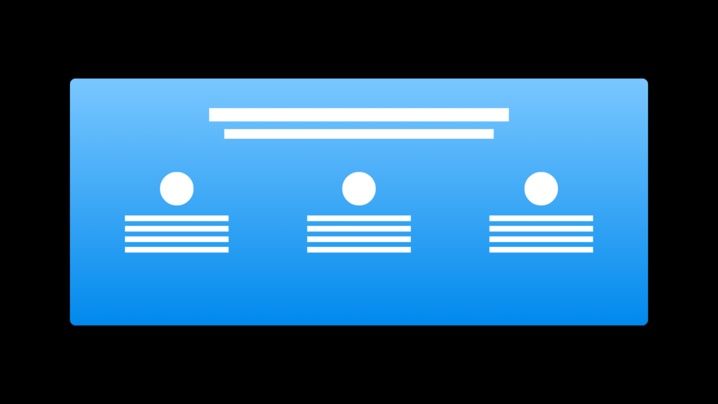
The most common design practice for this section is to create a 3 card layout with images or icons to pair with the benefit
Section 3: Product Demo Showcase
Be so good they can’t ignore you. – Steve Martin
This is one of my favorite quotes because I believe your work should represent you without saying a word. You should want to leave an impression with your viewers. Meaning, when they see your work they would say…
“WOW I need this”
or
“I need to work with this guy”
I hinted at this part earlier in the hero section because if you used this as a “teaser” then you already have given them a taste of your work. Remember you’re not limited to only one image throughout your page. In fact, it can help turn your visitors to customers just by showing more samples of what your offer can do for them.
Section 4: Social Proof
Why are testimonials important?
Imagine you about to go watch the latest movie and you tell your friend…
“Hey I’m bout to go watch the new marvel movie”
he tells you.
“Man you gotta better chance waiting when it comes out online”.
In that moment, regardless if you still go watch the movie your friend told you was bad, while watching it you will have their words in the back of your mind all while you’re trying to decide if the movie is good or not.
That is the power of social proof! It leaves an impression in your mind before you even get to experience it yourself.
This is how what others say about your stuff gives you credibility and trust.
So when designing the testimonials section they can be on their own, but you can also place them in the hero section.
Testimonials also work similar to images where it doesn’t hurt to have plenty of social proof throughout the page. In fact, the more the better because it shows how many people have used your product.
But what if you don’t have any reviews yet?
Great question.
I believe storytelling is one of the greatest skills you can learn. Why, because you can substitute those reviews with the story of why you created the offer in the first place. You can even include facts on why the product is necessary to the problem you were facing.
Until you gain customer reviews be creative in explaining why this offer helped you and can help others.
But before we move on to the next section there are 3 ways you can format your social proof section.
- Classic reviews
- Social media credibility
- Case studies
Classic Reviews
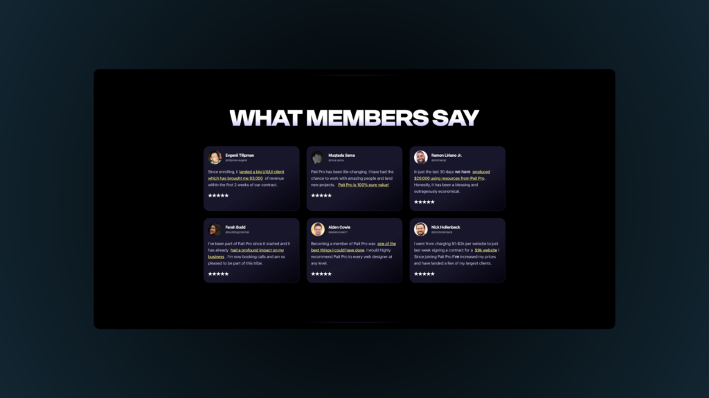
Usually the classic review, or the most common one, is a 3 small card layout with a picture or icon with a small snippet of what the customer experienced. Its best to keep these card simple and concise giving it a clean and consistent look.
The image above is a slight variation and includes 6 reviews but the idea is still the same.
Social Media Credibility
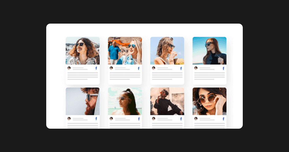
We live in a different time now and social media has affected us in every way. That is why proof on social media is just as good as any traditional review you can read. So if you get any good feedback from anyone on social media then I believe you have all rights to use it as a testimonial.
Case Study
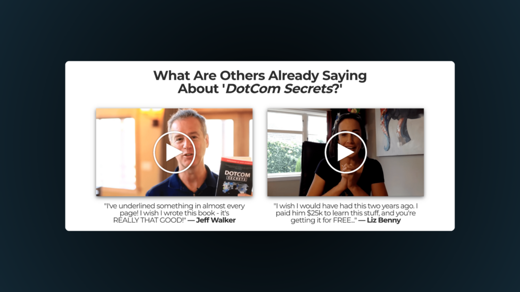
Now case studies are a little different. I’ve seen on other websites where they go in depth and give a deep dive analysis on a product or business and explain every aspect. However, when I think of case studies in terms of social proof it’s more of a video testimonial.
This can give a different perspective as well as help to connect more with a customers story. It also helps to switch things up then just having the written testimonials.
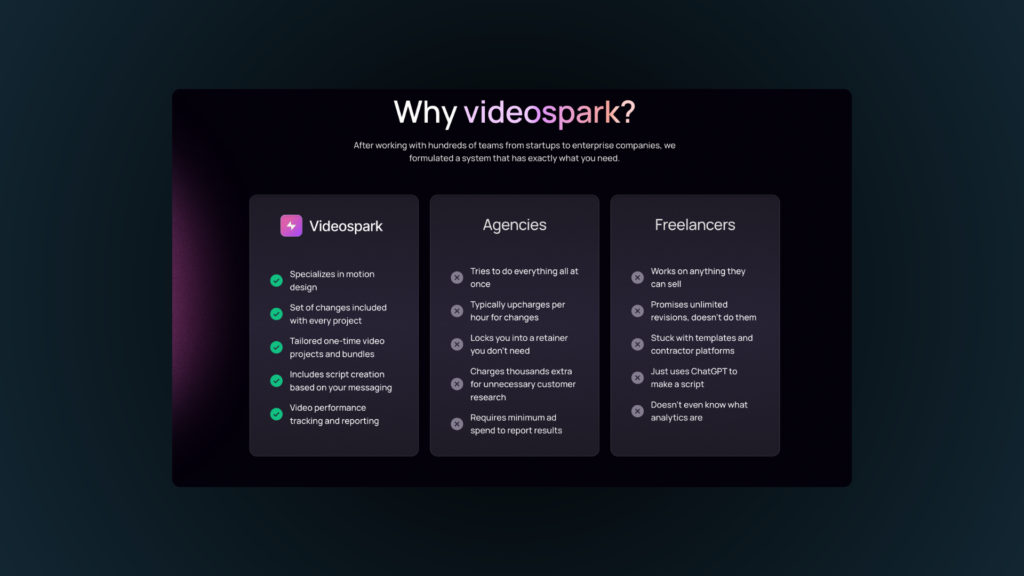
Section 5: Why Us
So now it’s time to explain why your product is better than what’s on the market.
This section is not just a place to talk about who you are but highlight what makes you stand out. I think you can do this in 2 ways. Simply telling why you created the product, or making a bullet list comparing yourself to other competitors.
I personally like the list style because it gives an easier way to digest your benefits and what you do. So if you can explain what you do in a list go for it.
Below is an image from my personal swipe files of how videospark showed their differences.
Section 6: CTA
Have you seen the movie Gladiator where Maximus comes around the tree and shouts out to the soldier…”PRAETORIAN!”.
This is that moment for this section.
The CTA, or call to action, is where you callout the visitor and present your sign up form, your CTA button, or pricing table.
If you’ve done a good job this is where your visitor will make their decision.
If you followed the idea of a landing page, meaning having one goal, then now is the time they’re really going to buy or leave.
Honestly, if they took the time to read and make it all the way to the bottom I believe they are ready to buy. If not, don’t worry, we have one more section to address those people who are still on the edge of the fence.
Section 7: FAQ
We all have questions but when it comes to buying something we can have a ton of them. This section is where you list all of the most common questions people might have when it comes to your offer.
But its more than just questions people are asking here but objections. Objections are things that slows people down from making a decision. So your goal is to answer (provide solutions) to all the reasons why people won’t buy your offer.
If you don’t know what those questions are there are a few ways you can go about finding them.
First, if you created the product you can write all the things you had trouble with when creating it.
Second, you can come up with a few initial problems you think customers might have.
And finally you can have a test trial and have others use it and then write down the questions they have after using it.
Conclusion
So let’s wrap this thing up. I know its a lot but after studying the structure of a landing page I can see that these 7 sections are the most important parts to include.
- Hero
- Solutions
- Showcase
- Testimonials
- Why Us
- CTA
- FAQ
But wait we’re not done just yet. Do you want to learn how you can put this into practice and get your own landing page?
I created this template to speed up the process of creating one.
Well, that’s it for now. You should now have a framework for building a landing page what to include and even a template to use or practice with.
Well, hope this gave you new insight and you got something good. Talk to you later.
Oh did you think I forgot? Here is that resource I promised on the 13 different landing pages. Im not just gonna leave you hanging like that.